Can I sign in with my .btc name? What is need to bring that feature to the forum?
1 Like
This is how we did it for .id
2 Likes
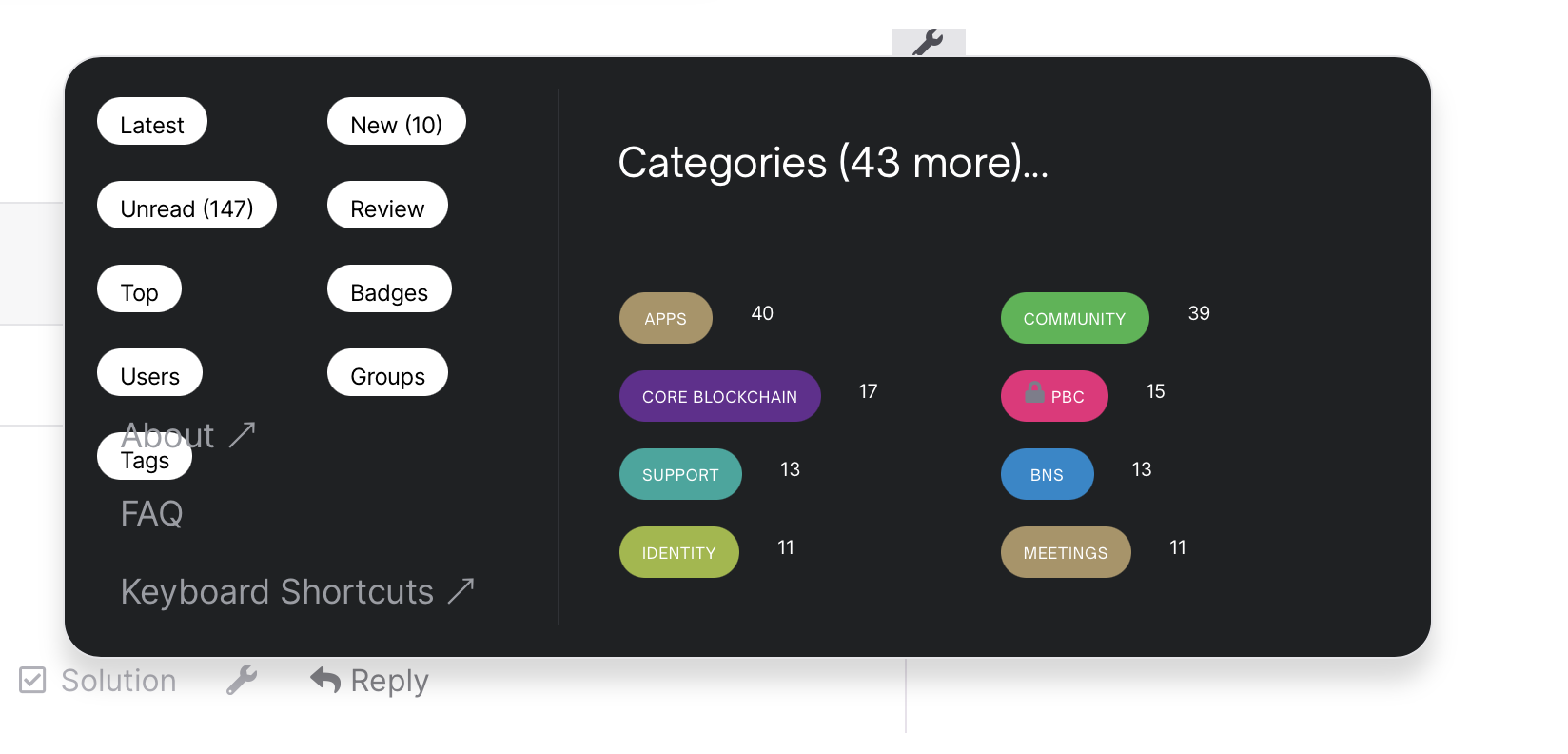
+1 on information density.
Easier to have an overview when more info on one screen than scrolling big text.
+1 to everyone else’s comments.
Looks good, but too big. My immediate reaction was to press cmd minus.
2 Likes
Thanks for the feedback everyone. Be on the lookout for more density optimizations soon.
2 Likes
Hi I’m discovering that many of the LINKS do not show up (they turn into white, blending into the background color) after we’ve moved to this integration.
They will only appear if you move your cursor over the link’s text.
In this #12 CAB notes, you will see the links to youtube, calendar, full notes, etc all become white text instead of previously were black color text.
Fyi, once you’ve clicked on the link once, it turns into a slightly different color.
2 Likes
Just signed up as of today. The forum design is great in my opinion! It looks good and seems to operate well. Don’t know what it was like before but I like the way you have it as of now.
1 Like
On mobile, I don’t see the side menu content
1 Like
The new “Learn | Build | Explore | Buy STX | Join” bar’s mouse-over pop-up menu is really annoying. My mouse is often at the top of my web browser selecting this tab, and when I move my mouse down to click on a new topic, it activates one of these pop-ups. It not only impedes the thing I was trying to click, but also I have to click blank space to make it go away.
Any chance the mouse-over effect can be removed?
2 Likes
+1 one to the mouse over popup being really annoying.
Text in links when editing is also invisible.
1 Like
Thanks for the feedback. We’ll improve the menu mouse over behavior and update the links colors. I’ll post an update here as soon as it’s done and will explain the direction in which we go to make that improvement.
2 Likes
More feedback:
The spacing between paragraphs isn’t much different than the spacing between lines. This makes paragraphs hard to read because they appear to flow together.
In this screenshot, there are 4 paragraphs but they visually appear as a solid wall of text. Perhaps increasing the space between paragraphs and/or decreasing line spacing would help.
1 Like
Any news on making information more dense? Feels like quite a few people thought that was good idea.
1 Like
Hi everyone, just want to note the following updates to the Forum that have happened in the past 3 weeks:
- Improved spacing between lines and paragraphs to show blocks of texts better.
- Switched the nav menu to click-to-open rather than the previous hover-to-open behavior.
- Increased density of threads on the homepage of the forum on both desktop and mobile. This is as dense as the forum will get given our brand guidelines.
Tagging @larry, @HeroGamer and @jude since your input was the latest.
Thank you for the feedback, as always.
2 Likes
Something is off with markdown or fonts. Bold is not bold:
This line is bold text
This line is not bold text.
I can see the barely perceptible difference.
1 Like
Search CSS is kind of messed up.
It is impossible to click the log in button/link on my iPad.
Also +1 to the problems @jeffd reported above.
2 Likes
Some display issue here on my latest post, all text are white.
Can this be resolved?
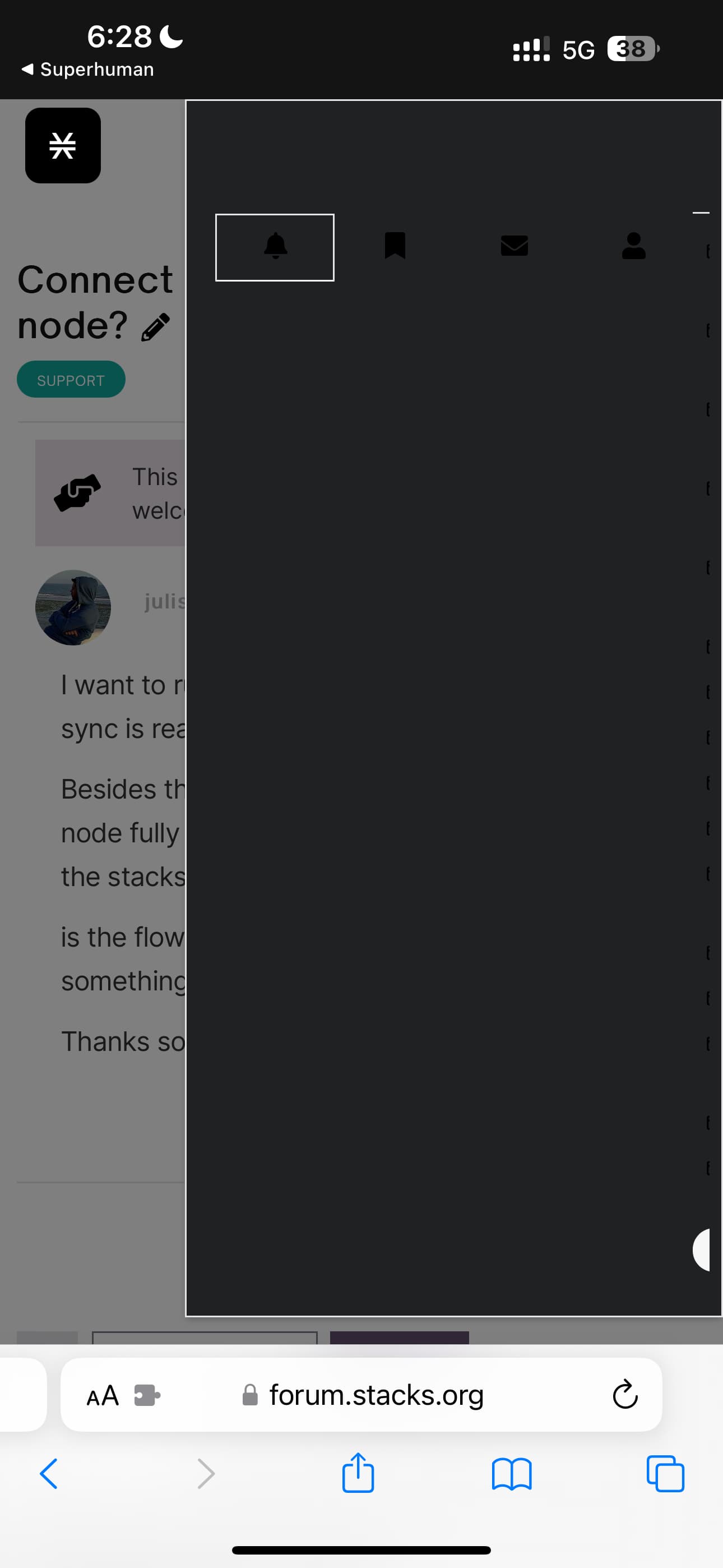
The theme/design is also basically unusable on mobile.
The text entry area is off the screen and you can’t scroll.
The profile menu shows up as all black?
If this is too hard to maintain, perhaps we can ditch the custom theme and just go back to the default, well tested discourse theme with a stacks logo and colors?
Hey @larry, some of the mobile and search issues should now be fixed. I’m typing this reply from my phone with no issues. CSS should work on iPad as well, tho unfortunately I don’t have one to test on. Please let me know if you are still encountering issues.
The custom theme for our Forum is an important part of our branding, but it is challenging to execute smoothly. We’re getting much better at, in no small part due to your guyses feedback. Very much appreciate your input and understanding. I feel like we’re very close to getting it all wrapped up.
Thanks @ivoandov. Here are some more:
Hamburger menu has an issue with tags and menu items overlapping:
Mouseover reply button causes it to disappear: