Something is off with markdown or fonts. Bold is not bold:
This line is bold text
This line is not bold text.
I can see the barely perceptible difference.
Something is off with markdown or fonts. Bold is not bold:
This line is bold text
This line is not bold text.
I can see the barely perceptible difference.
Search CSS is kind of messed up.
It is impossible to click the log in button/link on my iPad.
Also +1 to the problems @jeffd reported above.
Some display issue here on my latest post, all text are white.
Can this be resolved?
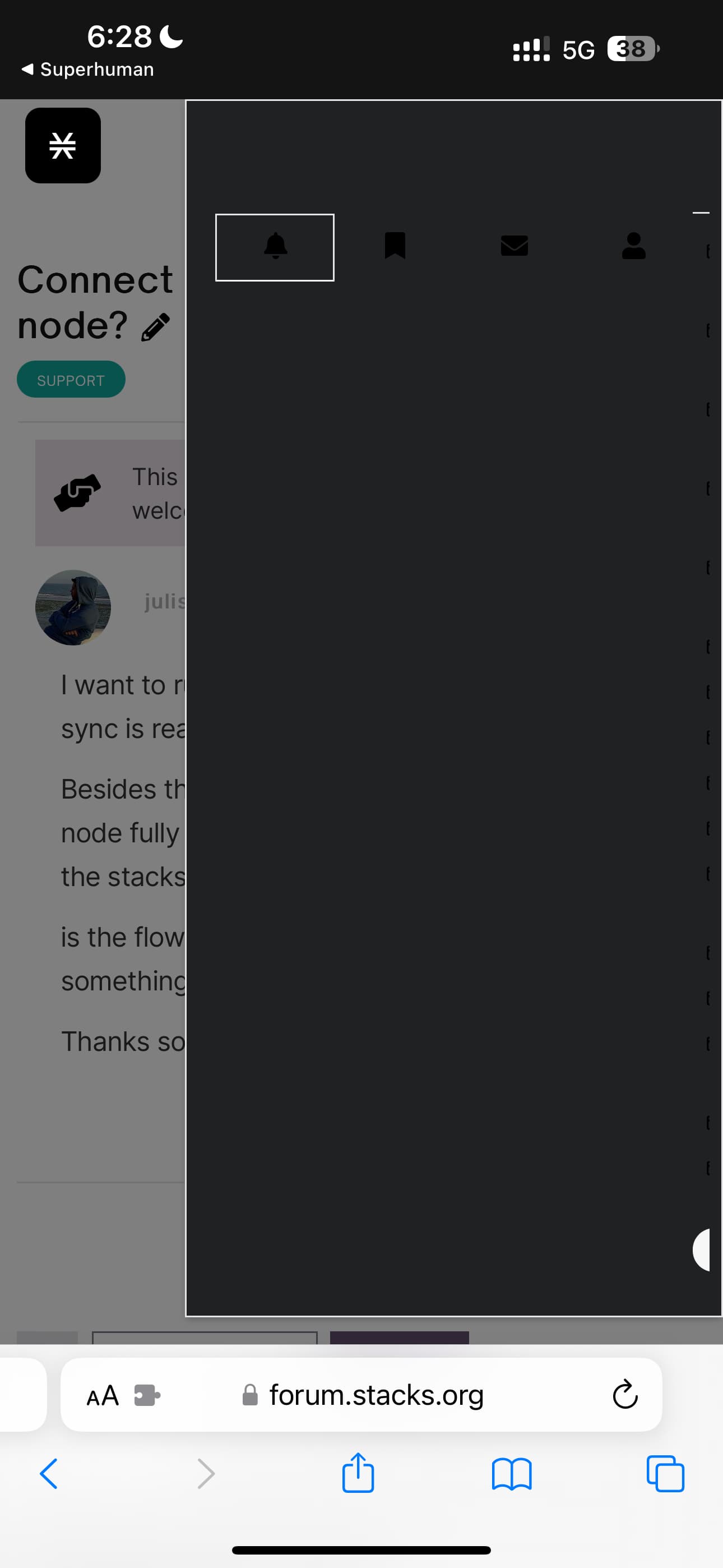
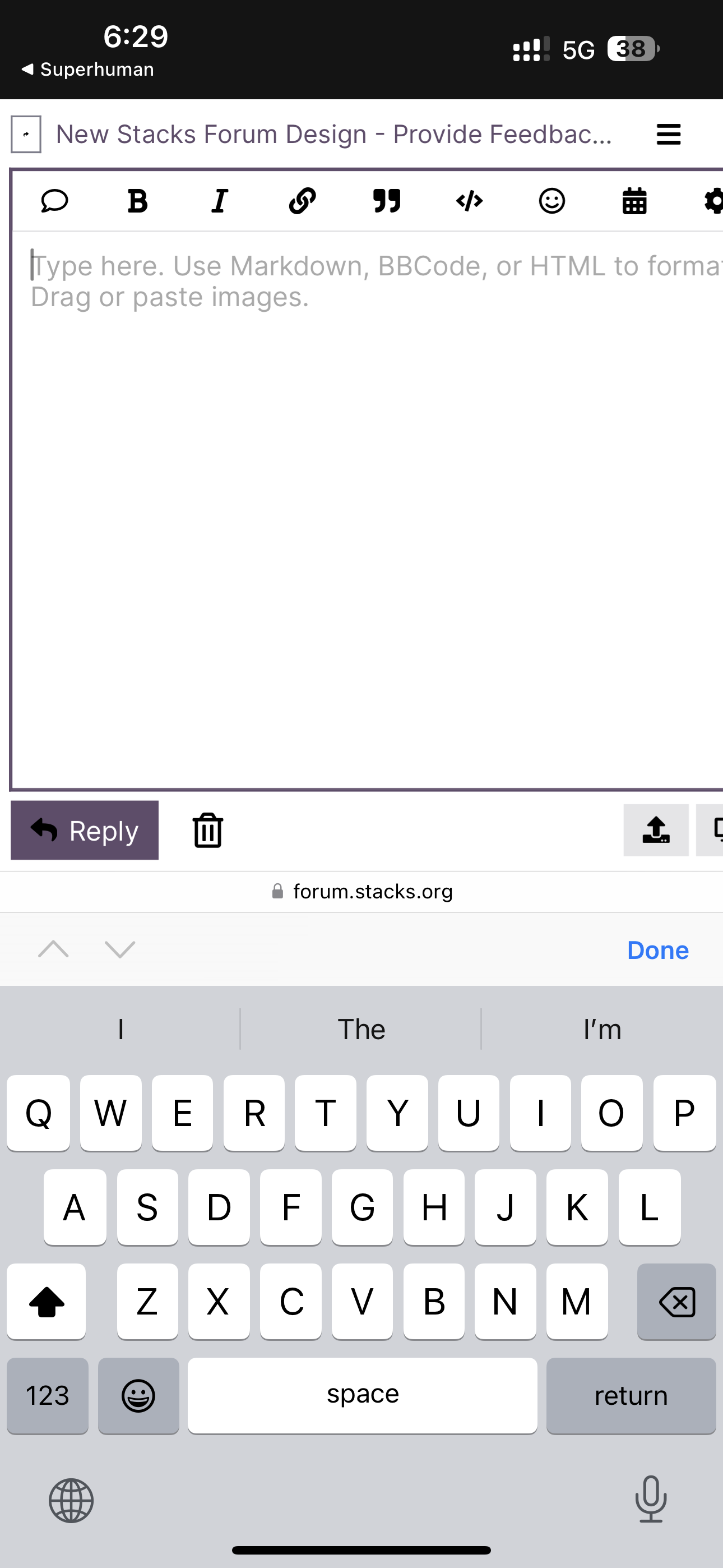
The theme/design is also basically unusable on mobile.
The text entry area is off the screen and you can’t scroll.
The profile menu shows up as all black?
If this is too hard to maintain, perhaps we can ditch the custom theme and just go back to the default, well tested discourse theme with a stacks logo and colors?
Hey @larry, some of the mobile and search issues should now be fixed. I’m typing this reply from my phone with no issues. CSS should work on iPad as well, tho unfortunately I don’t have one to test on. Please let me know if you are still encountering issues.
The custom theme for our Forum is an important part of our branding, but it is challenging to execute smoothly. We’re getting much better at, in no small part due to your guyses feedback. Very much appreciate your input and understanding. I feel like we’re very close to getting it all wrapped up.
Thanks @ivoandov. Here are some more:
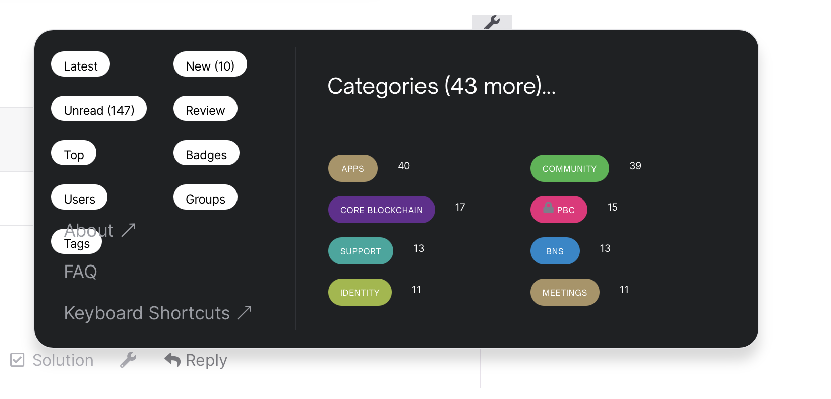
Hamburger menu has an issue with tags and menu items overlapping:
Mouseover reply button causes it to disappear:
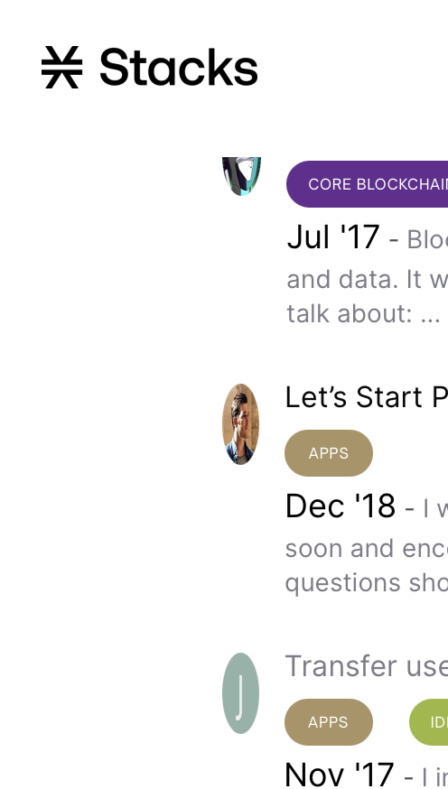
Another bug: profile pics on search page
Hi, having display issue here: PurplePill Friday <> Stacks Foundation - Community Grants Pilot #01 - Wed 19th Jul, 2.30pm ET - #2 by HeroGamer