As part of our ongoing efforts to unify the Stacks visual brand across various channels, we have updated the look and feel of the Stacks Forum. Starting today, you will notice the new Forum design on the homepage and individual topic threads, now more closely matching the look and feel of Stacks.co.
As always, we would love any feedback or input on the new Forum design. See something that is broken? Something that can be improved? Or you simply love the new design? Drop us a line in this thread to provide any feedback.
Hi @ivoandov! Shiny, looking forward to the end state. I’m guessing there’s some plan for a progressive update?
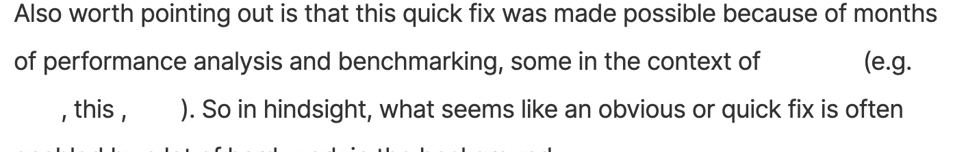
Right now default link colors are not working with the changes: unclicked links appear invisible (see screenshot), clicked links are barely visible (I’m hovering on “this” in the screenshot)
Hey @diwaker, thanks so much for the input. Yeah the colors for links should be updated here shortly. As far as the sparseness of the site, we do plan on tightening things up a bit - had to see how the live theme would perform across all devices before doing that. It will definitely not have the density it had before as those design standards are a bit outdate, but the topics will be presented more succinctly soon as well.
I love the new look and feel. I noticed that the topic list is a bit overwhelming, even on a large screen, but maybe it’s just me. Nevertheless, the new forum design looks more professional and informative than ever.
I like the new look. Agree with @diwaker about info density. My screen is pretty big and it feels like im viewing the forum on a 12 inch macbook screen.
There’s some issues with the badges on profile pics:
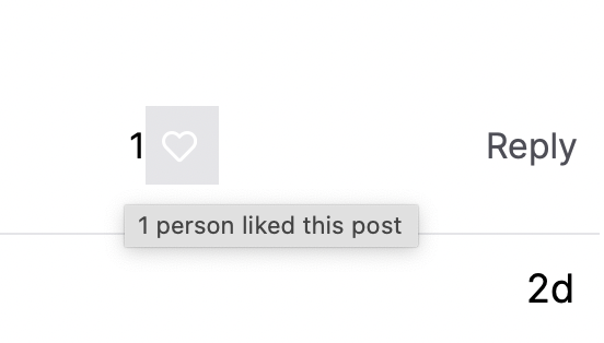
There’s also something wrong with the like button. I can’t see it on most posts but if i hover around eventually I can find it:
Overall it feels like it’s moving in the right direction - a much more visually appealing place to be!
Hi I’m discovering that many of the LINKS do not show up (they turn into white, blending into the background color) after we’ve moved to this integration.
They will only appear if you move your cursor over the link’s text.
In this #12 CAB notes, you will see the links to youtube, calendar, full notes, etc all become white text instead of previously were black color text.
Fyi, once you’ve clicked on the link once, it turns into a slightly different color.
Just signed up as of today. The forum design is great in my opinion! It looks good and seems to operate well. Don’t know what it was like before but I like the way you have it as of now.
The new “Learn | Build | Explore | Buy STX | Join” bar’s mouse-over pop-up menu is really annoying. My mouse is often at the top of my web browser selecting this tab, and when I move my mouse down to click on a new topic, it activates one of these pop-ups. It not only impedes the thing I was trying to click, but also I have to click blank space to make it go away.
Thanks for the feedback. We’ll improve the menu mouse over behavior and update the links colors. I’ll post an update here as soon as it’s done and will explain the direction in which we go to make that improvement.
The spacing between paragraphs isn’t much different than the spacing between lines. This makes paragraphs hard to read because they appear to flow together.
In this screenshot, there are 4 paragraphs but they visually appear as a solid wall of text. Perhaps increasing the space between paragraphs and/or decreasing line spacing would help.
Hi everyone, just want to note the following updates to the Forum that have happened in the past 3 weeks:
Improved spacing between lines and paragraphs to show blocks of texts better.
Switched the nav menu to click-to-open rather than the previous hover-to-open behavior.
Increased density of threads on the homepage of the forum on both desktop and mobile. This is as dense as the forum will get given our brand guidelines.