Try out the new, streamlined authenticator with Blockstack Connect (beta)

Blockstack PBC is proud to beta release a new authenticator that greatly simplifies the onboarding experience for users and emphasizes privacy as a core value.

We’re asking developers to provide feedback before rolling it out as a general release and eventual replacement for the Blockstack Browser.

Try it with our sample app, see integration instructions below, and submit your feedback.

Overview

The UX team at Blockstack PBC has spent the past six months researching the best way for users to get started with their first apps and continue accessing them reliably.

We pursued this work with several goals in mind:

  • Users start trying apps as quickly and consistently as possible

  • Users understand and appreciate at least one key benefit to using Blockstack apps instead of centralized ones

  • Users need to think and remember as little as possible

  • Users quickly continue using their favorite apps when they come back later

After exploring and testing various prototypes, we settled on a design in which new users mainly receive their new “Secret Key”. This is a friendlier term for the 12-word mnemonic seed phrase we’ve previously called a “Secret Recovery Key” in the Blockstack Browser.

And rather than placing the Blockstack brand front and center as a 3rd-party identity provider, we fade it into the background while talking up the privacy-protective nature of the app itself.

As such, the user begins their journey with the reassurance they can create, save and share data with the app without having to worry about their online privacy. We believe this approach is especially suited to apps designed for markets that require a high level of confidentiality.

Screens walkthrough

2%20Intro%20screen
Click to view the new authenticator UX screen-by-screen

Comparison to Blockstack Browser

This new authenticator boils down the existing Blockstack Browser to its most essential elements — onboarding and sign in.

Users are no longer expected to find or interact with a separate Blockstack website, and several features are omitted from this initial release, having been deemed non-essential for new users:

  • App listings
  • Identity management (including ID purchases)
  • Social verifications
  • BTC wallet
  • Settings

It’s entirely possible we’ll include this functionality in the future. However, we’ll assess and validate just what functionality makes the biggest impact for the most users before doing so. In the meantime, users can continue using the Blockstack Browser to access these features (e.g. to retrieve BTC holdings or renew paid IDs).

Perhaps most importantly, we’ve reduced the amount of information collected during onboarding. Users no longer need to submit an email address and password. Instead, they simply need to remember their Secret Key and provide a username. This not only makes onboarding faster; it reduces the cognitive load for signing in later on.

Existing Blockstack users who want to use their “Magic Recovery Code” can still do so by entering it into the prompt for a Secret Key when signing in. They’ll then be asked to provide its matching password.

Get started with integration

The new authenticator is called the Blockstack App and is hosted by Blockstack PBC at https://app.blockstack.org/.

We decided not to call it “the Blockstack Browser” since the use of “browser” has been confusing for most people (given it’s not actually a web browser).

We’ve also created a new JavaScript library called Blockstack Connect that helps app developers integrate Blockstack functionality more directly into their apps.

View the README for technical instructions on how to integrate authentication into your app.

Blockstack Connect helps keep users within the context of your app whenever possible instead of requiring that they leave for another site.

For example, when a user gets started with an app from its landing page, Blockstack Connect enables that app to display an overlay modal that introduces the user to their new Secret Key. This prepares the user mentally before the app subsequently triggers a new window to generate the Secret Key for them.

We plan to extend Blockstack Connect in the future for even greater in-app functionality.

Metrics

Third-party analytics have been integrated directly into the Blockstack App as hosted at https://app.blockstack.org/ for this beta period so we can study aggregate usage patterns, not individual users or sessions.

We plan to replace this direct integration with a proxied one in time for general release, to further ensure that we’re not collecting any unnecessary and sensitive user data.

We have not integrated any analytics into Blockstack Connect itself.

Feedback

Please provide your thoughts in the comments below or fill out our quick survey!

And if you run into any bugs, or would just like to dive into the code, please check out the repositories for these projects:

14 Likes

This seems like a security issue, especially if a malicious app pastes the key without your knowledge.

1 Like

Good point, we may want to prevent this by clearing the clipboard after the user selects “I’ve saved it” on the following screen.

I think it’s a valid concern. Although 99% of users will store their key via copy/paste, it would make sense for power users to have other options.

Here is what Github offers when providing recovery codes for 2FA:

4 Likes

Thanks for the comment @russ. The Clipboard API ensures a web page can’t read the contents of the clipboard without a user’s permission. This may differ for native apps, though.

1 Like

As an app developer should i worry about differences Blockstack Connect will bring? Is it going to be compatible with radiks? Will we able to access user public and private keys?

2 Likes

I totally get trying to be frictionless, but I have seen several apps go as far as preventing screenshots in the process. Ultimately isn’t the goal to have the user to write down the key? I’m not sure which is worse, unpleasant on-boarding or someone losing a key due to a fried hard drive.

1 Like

Thinking a little further on this…
Since the user’s password is also needed to login… this wouldn’t be an issue at all.

Never-mind my comments! :grin:

1 Like

I want to know about what @talhasch is concerned about too

1 Like

Nope - it still uses regular old blockstack.js under the hood. You still have the same API and userSession - no change at all. You can even bring your secret key from the Blockstack Browser into the new authenticator, and you’ll get the same IDs, app private key, etc.

In regards to Radiks - also no change. Banter uses Radiks and connect works out-of-the-box.

Edit: With more thought, it’d probably be good to have some ‘migration’ docs. Until then, the only thing you’ll need to change is probably where you call redirectToSignIn. Instead, use showBlockstackConnect with the appropriate AuthOptions (see the Connect docs). For an improved user experience, implement the finished callback to update your app’s state as soon as they’re logged in, skipping the need for a page refresh!

2 Likes

It’s also worth noting that we have no plans to automatically redirect traffic for any existing apps that implement authentication with the Blockstack Browser to this new authenticator.

Developers have the complete choice as to whether, when and how they want to implement this new authenticator in their apps. And we plan to continue hosting the Blockstack Browser for any apps that don’t make the switch for whatever reason.

1 Like

Well passwords are being deprecated so new users will not set them during onboarding nor use them to sign in.

Only existing users who wish to use their Magic Recovery Codes to sign in will see a prompt for entering a password.

Yep, this is how it’ll probably play out:

  1. Apps can opt-in to connect and the new authenticator by default
  2. Apps that don’t upgrade will still send users to the native/hosted “Blockstack Browser”
  3. Users that install the extension will get to use it for all apps, regardless of if they upgrade.
    a. Note - this is not implemented yet

Great to see this in beta now!

The explaining modal dialog is nice and has also been validated by TMUI with all the apps from Brazil :slight_smile:

I am a bit concerned that the identity management has been removed. I am not sure what the impact will be on the ecosystem. Maybe society is not yet ready for DID management. For now, profile images will all look the same and there won’t be any names, just usernames (ending with id.blockstack). Adapting our apps to that should be into “migration” documentation.

I would like to see the connect library licensed under CAL, not MIT. Otherwise the claims in the modal dialog are false or at least misleading about what the apps are doing. The apps can do all sorts of bad things…

I just hope that the data won’t drive us away from Blockstack’s vision of a user-owned internet. I would like to see collections and a data explorer sooner than later!

About a the technical detail, can I present my app as ꓐanter (with a different B) via the optional app details? And thereby trick the user? Not sure what the advantage would be, maybe discredit Banter or show fake contents?

app.blockstack.org as a landing page should be improved (for users that don’t have the extension).

1 Like

Clicking the Button

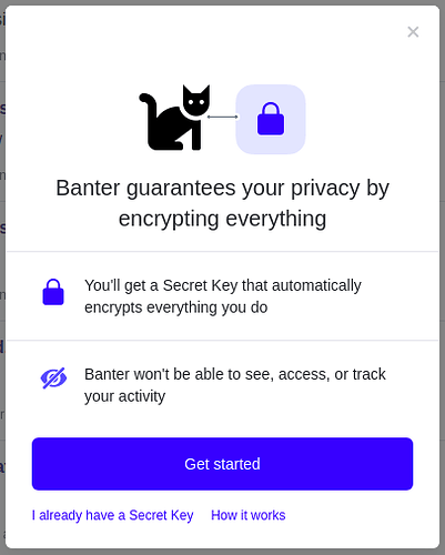
First impression - this looks great and super easy to use. I love the layout and think this mimics what we see when two apps connect: a picture between the two with arrows. I think right underneath that would be perfect for the Powered by Blockstack logo, and it would help with associating “blockstack” and “secret key” on the first paint of the modal. Before I click on to get a secret key, I want to know who’s giving it out. (which led me to How it works)

Clicking outside the Modal

pub%206928fccf8a46

While looking at How it works, I clicked outside of the modal which closed it and the button was stuck on “Loading…”. Clicking the button again still opens the modal.

Note: added this one to an open issue on github. Close modal when clicking outside of it or hitting escape key #51

How it Works page

  • can we capitalize the W in How it Works? (I think it looks so much nicer!)

“Banter keeps everything you do private with Blockstack’s Secret Key technology”

  • can we bold Secret Key to put more emphasis on it? Or link it to a blockstack page and intro to the service? I think this is a great way to brand the concept to a Blockstack dApp, and it could easily be talked about by normal users without having to explain too much. Ideally, you want that basic conversation between users: “Do you have a Secret Key?” “Oh, you mean from Blockstack?”. I see potential for that here and I love the initial capitals as well. Secret Key. Secret Key. Secret Key.
  • Free ad for you, made me :smile: “You need a Secret Key to access the new Internet, and the good news is, I know how to get one.”

Encryption is always on. It locks everything you do in Banter into useless codes. Because of this, Instagram can’t see or track your activity. Your data can only be unlocked with the key that you own. No one else has this key, not even Banter, so no one else can unlock your data

  • I think this is a great explanation, but I feel like it could make a bigger impact in a slightly different order.
  • Encryption is always on and protecting your data, and it can only be unlocked with the key you own. No one else has this key, not even Banter, so no one else can unlock your data. Because of this, Instagram can’t see or track your activity.
  • Also, I think there is a better way to generalize this statement against companies that track activity, then give examples, rather than directly list Instagram as an example, it would be more powerful and have a broader reach.

Your Secret Key unlocks your data. It’s created independently from Banter to make sure that Banter doesn’t have it. An open-source protocol called Blockstack generates your Secret Key when you sign up. Nobody but you will have your Secret Key, to make sure that only you have access to your data.

  • This would be a great place to promote using the key for other apps as well! (last sentence)

You’ll need your Secret Key to prove it’s you when you use Instagram on a new device, such as a new phone or laptop. After that, your Secret Key will stay active to keep you safe and private in the apps you use on that device.

  • Was that supposed to be Banter instead of Instagram?
  • For the last sentence “apps” sounds too generic, maybe highlight the active app then refer back to all?
  • “After that, your secret key will stay active to keep you safe and private in Banter and any other Blockstack apps you use with the device.”

I already have a Secret Key

The little pop-up window looks great, very easy to understand, and while the URL is extremely long (with good reason!) the initial view of it is simple: auth.blockstack.org and actions.html with a valid SSL cert.

I did have a random idea related to the “Powered by Blockstack” button. Would there be any way to make this a “security image” like the extra layers some banks do to ensure the website is the correct website? I worry that a bad actor could mock something up something similar to this to steal the Secret Key. That way if a user didn’t see that, they know not to use the app.

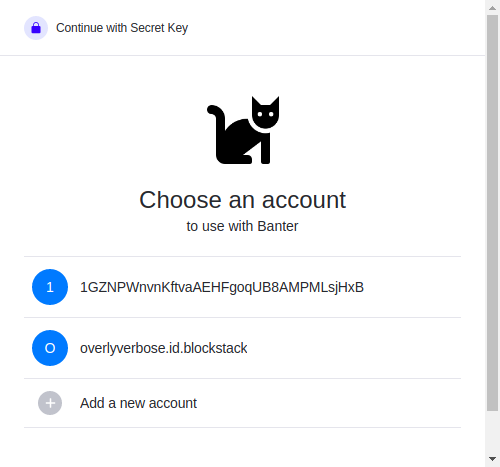
There could be a max-width value on auth.blockstack.org, but it still looks good if you make it full screen. (screenshot below)

3%20Screenshot%20from%202020-02-19%2015-05-57

While looking at this page I was showing my wife how easy the account sign-up process is and started walking through it, but it appears I was able to create an account without getting the same “choose an ID” screen at the beginning. It went directly to the 12 word phrase, and I closed it out shortly after and didn’t save it. What happens now? Can I recover that? I see it on the list as a raw ID.

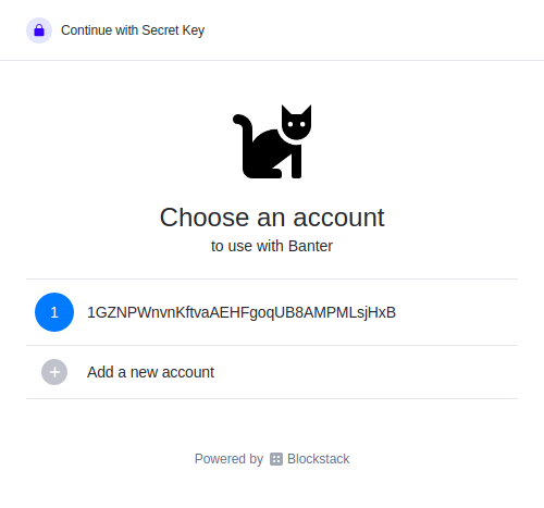
I also noticed that as I went to do the next step (Get Started), it was nice to see that my already created ID shows up no matter which way I load the page (i.e. Get Started button from the app, I already have a key, and I already have a key > get started). This should really help if someone creates an ID, forgets about it, then comes back. (except mine is so messy)

Get Started - Add a New Account

Ah, now for the fun part! First choice: verbose.
Error! Your username should be at least 8 characters, with a maximum of 37 characters.

Second choice: OverlyVerbose
Error! You cannot have symbols, spaces, etc in name (although I don’t think I did? does it have to be lowercase?)

Third choice: overlyverbose
It worked, but I didn’t get the Secret Key, instead it went to a message about entering my email and now I’m logged into the app. I was able to post and work with the app as expected, though.

Profile Page

Nice and simple, but the ID pushes out of the container. It needs overflow-wrap!

Settings are also straight-forward, and I like how an app could still collect an email for contact, or do whatever they need from this perspective.

Log Out and Back In

The button did exactly what I expected: logged me out!

4%20Screenshot%20from%202020-02-19%2016-17-21

When I go to log in again, I see the first ID I created without a name, and the name I created without a Secret Key.

Maybe the third time will be the charm?

Clicked Add a New Account

I ceated: lessverbose

It worked, but again the little pop-up window disapppeared and I am logged in without knowing my Secret Key.

Note: added this one to an open issue on github. Handle when user ends auth before finished #8

Final Thoughts

This is amazing. I think this will be the perfect way to get people onboarded, into, and using Blockstack save the little stuff I ran into above. FWIW I am using Vivaldi 2.11.1811.38 (Stable channel) (64-bit) on Linux Mint.

Bugs aside, I cannot express how happy this makes me. The original process with browser.blockstack.org I could understand, but couldn’t recommend to “friends and family” without hand-holding and trying to convince them to use it. This is clean, simple, and straight-forward (as it should be!).

(Note: I will try to get these issues over to Github when I have time)

2 Likes

I still like the idea of being able to add a profile picture and name later, but my guess is the average user is going to want to dive in and use the app, not go through a bunch of steps to sign up for it and set it up. The profile pic in each app is a nice touch (and helps me know I’m using the correct login when using multiple IDs).

The id.blockstack part I like because it standardizes the DID in a fairly human-readable URL-like format that users could remember. I also like the idea of being able to customize it, but again, that’s more of a power user feature.

I’ve seen people click through multiple screens without reading them. I’ve seen people sign up for 2nd and 3rd accounts because they forgot credentials to the first. I’ve seen people abandon services because they forgot how to log in. To me, Blockstack needs to capture this “create an ID” process so that someone can sign up for one, see it the next time they log in (which looks good now), and somehow be able to use it in 6 months when it pops up again and they forgot everything.

That last part is a little tough depending on how the secret key is saved by the user. Will they write it down? Will they just click past it and forget about it until they log out of the app? Do we have a secure way to store it in their brains?

Time will tell, but I do think this is all on the right track!

1 Like

I gotta commend the “how it works section.” App creators should take a look at the language. No Decentralization, no blockchain term used. Everything is in layman’s term.

I particularly love the loading messages before getting on the your “secret key” page. This whole on-boarding process is a step-by-step education series of why use of a Blockstack auth. From a user perspective, I wouldn’t mind switching because of the clear benefits that was stated in the process. Lastly, the several goals that was pointed in the forum post was achieved by the product team.

2 Likes

I also got an error when I tried registering a pure numeric ID, I closed the session then I got this username instead 1HavXUrvxCrb665hPmx9aYi2vT44k2i7k8 and when I tried to use the account to post into banter it gets stuck on my signing-in session and produce this error in my console

1 Like

Just observed this minor issue in Click to view the new authenticator UX screen-by-screen figma walkthrough screens 15 and 16 are cutoff from the left . negative space needed .

1 Like

We doubt that the ultimate “best” place for most users to save their Secret Keys is on paper. However, it’s not entirely clear where then is the best place.

Encrypted password managers like 1Password seem like good candidates. and many users may be served well enough by storing their Secret Keys in their devices’ Notes or Photos apps. Yes, that means they have to trust the security of their device and cloud service (e.g. iCloud). But they may trust it enough and enjoy the convenience of having their Secret Keys always at hand digitally.

Of course, for anyone who wants to save their Secret Key in cold storage, that should always be an option. It just doesn’t seem we should be necessarily encouraging that in the UX.