Blockstack.org Roadmap

This is a roadmap for how we can strategically get the Blockstack app onto blockstack.org.

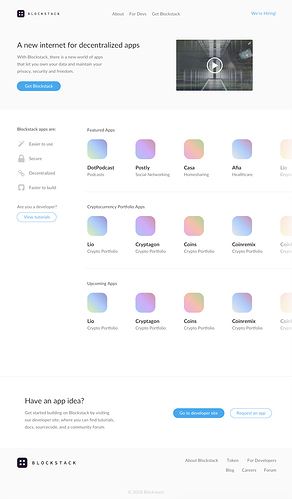
The motivation is that rather than explaining Blockstack with our website, we believe it’s a more effective strategy to let people see for themselves by getting them into the app explorer as soon as possible. In the future, blockstack.org will simply be the Blockstack app.

Initial Mockups of a new Landing page:
https://invis.io/WVFVH0LH8ZQ#/279873311_Home_V2


(Preview)

Considerations

  • We should take opportunities to resolve technical debt while we’re modifying code. That means making React components more modular, moving CSS to Sass, writing unit tests, etc.
  • Being that we’re planning to redesign the website and messaging, our gameplan should allot appropriate time for the entire design and discovery process.
  • At large scales, the app explorer will be a complex app, but we’re not there yet. It’s best to leave it as simple as possible for now so we don’t waste time building features we don’t end up needing.

Phase 1
Move the app explorer to blockstack.org

Moving the app explorer into the blockstack.org repo will be trivial since, in its current form, its a simple HTML page. The new app explorer will be placed on the homepage of blockstack.org.

Considerations:

  • The app explorer should be isolated so it’s portable for Phase 2.
  • We will want a well executed design here with weigh-in from team and potentially investors.
  • This is also a good opportunity to build the hyper-simple foundation of an Apps API. At first, we can just store a list of apps accessible via an endpoint, but in the future we can add a CRUD management layer.

Bonus Points:

  • Build a simple admin dashboard for our team to easily add applications to the app explorer (If we used something like Django for now we get an admin dashboard for free) (in the future this will be a decentralized directory)

Timeline:

  • 2 Weeks: Design mockups completed for the homepage
  • 2 Weeks : Dev completed on the App Explorer app

Phase 2
Migrate blockstack.org content to Browser app

blockstack-browser is a very feature rich app, so it makes more sense to move the fairly simple blockstack.org repo contents into the blockstack-browser repo.

Considerations:

  • We should do this on a fork off the develop branch so development can continue while the large changes are being developed.
  • Here’s one spot we can take opportunities to resolve technical debt while we’re moving code. That means making React components more modular, moving CSS to Sass, writing unit tests, etc.
  • We should make sure vital non-UI code is moved over the new codebase, like any scripts we need, etc.

Timeline:

  • 2 Weeks: Code transfer and cleanup complete :slightly_smiling_face:

Phase 3
Redesign

We really want to redesign the app experience. I think it makes the most sense to do this before a big unveil, for a few reasons.

First, this is a dramatically new vision for our user experience and we should turn heads when it’s launched. We don’t want to roll out a new vision and have it feel half baked.

Considerations:

  • We could launch once Phase 2 is complete and then make the design refresh a separate launch. I think we should do a redesign though.
  • We could also break the redesign in two — 1) app pages and 2) info pages

Timeline:

  • 9 weeks: We need to give this step some room, and clarify what we hope to accomplish. Conservatively, if we’re scrappy, I’d say 6 weeks. Liberally, 10-12 weeks. Let’s meet in the middle for these purposes.

Phase 4
Move browser.blockstack.org to blockstack.org

With work complete, we can point blockstack.org to the Blockstack application site.

Considerations:

  • We’ll want to make sure if we’re moving URLs around that we implement redirects so we don’t take a hit on SEO.

Timeline:

  • 1 Week
13 Likes

Reposting the mockup that @hologram put together along with a photo preview:

https://invis.io/WVFVH0LH8ZQ

3 Likes

Good call @ryan – just edited my post to give it more priority on the page.

1 Like

Wow this is nice, Chase. You work fast!

3 Likes

I think this is a great move. App discoverability is going to be a huge thing for developers and users. My question is regarding long-term plans for the featured apps section. Right now, there aren’t a ton of apps working outside of bounty apps. But that will change soon. Do you all have a plan for choosing featured apps?

There has been talk previously about a number of things including:

  • Confirmed encryption
  • Uniform data schema for easy data portability
  • Some sort of peer review process

Would love to hear you thoughts!

1 Like

Posted from Blockstack Slack #design channel (chat.blockstack.org)

Nice. So Blockstack.org becomes the app store or discovery point for apps?

Chase Wackerfuss [1:37 PM]
Exactly. Show not tell!

Guy Lepage [1:41 PM]
Hm. It should be interesting to see what the feedback is from both developers and users. I feel like this will get users using apps faster which is a great thing for developers like myself.
Should be interesting to see how this dual comms layout will unfold.
I do feel that my eye does not know where to go with this layout. Should I learn more or click on apps or click on the left navigation.
Very clean and sexy though. Like the UI but feel as though use of high contrast in the type along with use of heavier weighted type will assist a great deal in getting the eye to flow down the screen and direct them where the highest emphasis is first, second, third
Love that you’re using the newest “bug logo” as well. Looks so much more finished and cleaner (edited)
Nice work @chase
:smile:

Chase Wackerfuss [1:53 PM]
That’s a good point @guylepage3 – I’ll keep the type suggestions in mind when I’m coding. That’s something i can iterate on in the browser more easily

Guy Lepage [1:54 PM]
Overall this is a great change for the community. Looking forward to seeing this live. :heart_eyes:

1 Like

@ryan will be able to give you a better answer, but a featured app should follow a list of “Blockstack app requirements” that make the app decentralized and secures all user data, including usage analytics.

You mentioned confirming encryption, uniform data schema, and peer reviews – I think we’ll get to those concepts that help us decide if a Blockstack app adheres to our guidelines soon, but in this initial push, this is at least my thinking:

At large scales, the app explorer will be a complex app, but we’re not there yet. It’s best to leave it as simple as possible for now so we don’t waste time building features we don’t end up needing.

1 Like

Looking at netlify deploy, quick thoughts:

  • We’re missing any kind of CTA to get started or download. Should be something like “Join Blockstack” or “Join now”.
  • The thumbnail on the video is rough. Do we have any single image we use to conceptually hint at what blockstack is? If so, that should be in there.
  • If you keep the headline really short like that the entire top section could take up less real estate.

Copy:

The small amount of feedback I got was that “new internet” is not meaningful to most people. And I noticed we lost the explanation text, which I thought had some good stuff. Also, for the side panel, maybe describing what apps are is not as valuable as describing what Blockstack is good at.

Copy suggestions:

Top section:

Decentralized apps
A new internet, powered by blockchain and designed for personal data ownership—not advertising.

Decentralized apps
Control your own data and keep your privacy, security, and freedom.

Decentralized apps
A community where users own their data and apps run locally. Take back control over your digital life.

Side section:

Blockstak apps are perfect for:

  • Network effects
  • Marketplaces
  • Secure networks
  • Massive scale
  • Total privacy

Might also just be a short paragraph:

Blockstack apps build in javascript, secured by the blockchain, and are serverless. Build your app, and join a community committed to a decentralized future.

3 Likes

Hey @jeffd, great feedback, thanks!!

I’ve created a mock with my favorite copy items you suggested. One thing to note is that we’re purposefully trying to move from “install blockstack” to “use a dapp and then register with blockstack once you find one you like” … for that reason, we talked about giving the header CTA less priority by putting it under the video and linking out to the About page. Right now this says “Learn more”, but open to suggestion.

Also, I couldn’t find a thumbnail from the video that very concisely graphically explained Blockstack, so I chose a thumb of Ryan speaking. Let me know if you find one you like more!

cc @ryan and @yukan

1 Like

Nice! I love the clean look, and using the Dapps as an first step into using Blockstack. Most token sites are geared strictly towards developers, but I like this reframing.

My only thoughts are

  • You might want to say “Get Started” or “Download Blockstack” instead of “Get Blockstack”
  • I’d love it if that video was 1-2 minute overview of what some of the apps looks like
  • I wonder if you could A/B test “A new internet” vs. “A new browser.” And see which resulted in more click throughs to download. You have more experience at this than me, but as an average user, a “new browser” is a visual application that most people understand, a “new internet” sounds abstract and might raise hesitation to take action.
3 Likes

Chris,

Thanks for feedback! I really like “Get Started” as an alternative to “Get Blockstack.” Perhaps even “Install.”

Update to this roadmap:

We’re going to be launching this homepage redesign shortly along with a new page called “What Is Blockstack.” We’re still awaiting content updates and feedback on that. Here’s a link to the mock for the new What Is Blockstack page: https://invis.io/WVFVH0LH8ZQ#/283789104_What_is_Blockstack

What is Blockstack: “Blockstack is a decentralized app ecosystem wher users own and control their data. Blockstack’s platform helps entrepreneurs and ingineers buid these apps and deliver better end-user experiences.”

I know target now is technically skilled early adopters and entrepreneus, this is a great description to them, but my raw take on this is:

99% of people does not understand what means “decentralized”.
99% of people does not understand what means “ecosystem”.
99% of people does not understand what means “user”.
Entrepeneurs and ingineers they already know that Blockstack “will help them buid these apps and deliver better end-user experiences”.

I want to convince my mother, my cousin… my proposal is fast, furious and short:

Blockstack:

“INTERNET IS YOURS, OWN, CONTROL AND MONETIZE YOUR DATA NOW”

Blockstack’s motto: “INTERNET IS YOURS”

Peace :slight_smile:

4 Likes

Valid points. Though as you mentioned, currently the core target group for the landingpage are at least not “my mum” or “my cousin”.
Things are still pretty early, the apps, the platform, everything is pretty bumpy … IMHO the platform is not ready yet for a broad audience. A mainstream audience will not appreciate what they see and get.

Currently you need still early adopter who trade some inconveniences for “the cause” of a better internet in the future. Users who appreciate the things that already exist and who have the experience/skills to imagine what all this might become.

Therefore addressing these with terms and a tone of voice that they are familiar with is not necessarily a bad thing, as long as these terms specify things of course.

I like your optimism :wink:, though I think by far not enough developers know about Blockstack.

3 Likes

I like that direction.

“The internet is yours. Own & control your data.”

2 Likes

Put together a short PDF presentation explaining how we could house both account management and the app store under the blockstack.org domain name (rather than using subdomains) so that the site could essentially function like a Blockstack app. Using Prismic as a headless CMS for both our blog and our pages, the marketing site could be nicely automated so that we don’t have to touch the repo for changes.

Download File (6).pdf (2.1 MB)

I’ve also been thinking about how we can organize this code – and I’m thinking this might be a good approach so that we’re not centralizing the codebase into a megolith:

  1. App Store - npm module of React components / or React app that lives inside the blockstack.org shell app
  2. Account Management - npm module of React components / or React app that lives inside the blockstack.org shell app
  3. Blockstack.org - react app that pulls in #1 and #2, and also manages the marketing site headless CMS integration

Would love to hear thoughts!

2 Likes

Let’s go !!!

Blockstack what or WHY:

What Bittorrent is ?? decentralized sharing and storage files protocol. (Nobody cares about)
WHY Bittorrent ?? download large files for free. (I love it, I want it… take my money)

/

What Blockstack is ?? decentralized internet protocol, decentralized apps where you own your data.
WHY Blockstack ?? keep and monetize your data.

(I also hate monetization word… but at this time we need it…)

I am pretty sure… Blockstack’s key features (identity and wallet) must be visible without login.

Luck

1 Like

Thanks so much for sharing. Love it.
Super excited about the full remote experience (no need to install a local blockstack thingy).

One comment regarding the site structure:
I was wondering if it makes sense to have different landing pages for “not signed in” users, than for “signed in” users .

I think I mentioned it before somewhere, I am not sure, if it is for Blockstack.org the right time to bring the app store front and centre, for two main reasons:

A)
We should assume that the concept of dapps for a huge amount of users is still a pretty unfamiliar thing (they might have just read this one article, that included that link, that they clicked a second ago).

Therefore even without watching the video (many users simply can’t watch a video in certain moments (being at work, no audio allowed etc.)), it would be great to understand, what this “decentralised” internet means, how it works and what I have to do so that it works.

Even if that means, in the best case, “you have to do nothing, it just works” … but you have to address these concerns that many users might have. People get curious, if they hear about a “new internet thing” that seems to make everything better.
The minds of users can get wild at this point… people might think that this is some BitTorrent client that does weird things… others might think that it is something like a VPN, so I probably I have to install things and afterwards my internet is super slow ;), or people might even think it’s as weird as mining some coins etc…

The fact that no installation is necessary IS AMAZING, really, so cool guys, but still you have to tell me how this works (and I mean not the technically stuff, I mean an explanation for 12 year olds) and you have to sell all the great and liberating things that this kind of apps bring with them.

(And yes, I know, it is super super hard to do that, in just a few inches of screen space … not saying it is easy ;))

B)
We all work super hard to ship amazing apps, but it is nearly impossible to get right out of the box the same quality of apps delivered than the big guys from the old internet, not too mention advantages based on network effects that established apps already have.

So in order to understand how amazing apps like Graphite already are, users have to understand the context that this app brings with it. If users do just a 1:1 comparison users might be underwhelmed and it’s simply not fair.

It’s just a gut feeling, and obviously I have no data for this, but I would assume most users have to become first hooked with the concept and movement of Blockstack, believing in a better internet, before they might be willing to take the sacrifices that an early platform, early stage products bring with them, and instead of being underwhelmed they might be fired up to support the apps.

If the app store is front and centre many users might jump first into the apps, before they look into Blockstack and the details, or watch the video… if they do at all. Which IMHO might be a disservice to the apps.

In future, I am hundred percent sure, the apps have to come front end centre, cause they will deliver experiences that are as good as the ones from the old internet, just living on a better internet :wink:

3 Likes

@hologram
The UI is wonderful, have you done any user research to back on the UX of the landing page?
You wanna arrange features based on what real users are thinking and expecting.

Keep up the great work! :slight_smile:

Great feedback @intel.id

Selling the “Why”: yes, it requires a commitment, so not only does it take more courage, because you’re standing for something, but it is also tremendously more effective in marketing. The “What” is only there to back it up with credibility.

@digitalwaveride has a point, and the effort should continue to be on convincing developers to build dApps.

In addition, I would separate the two messages for the two separate audiences.
Convincing developers to build on top of the BlockStack, when the only thing they still know is the client-server model, takes a very different approach then convincing users to try an App regardless of whether it is decentralized or not.

A little bit of polarizing can also do a great job in marketing…

1 Like